| Page layout and graphic design | ||||||
|
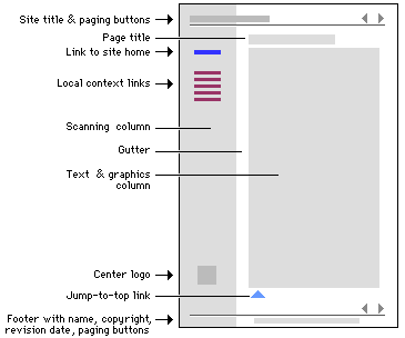
Page layout You should have noticed by now that the websites you have visited so far in this module usually have certain common elements which appear on each page. For instance, did you notice any of the following on the websites you have looked at (see diagram below for reference):
Graphic designThe graphic design element of your page could consist of two main features:
Allow yourself to be influenced by good ideas, but do not copy designs or logos exactly. You could copy images and make significant changes to them. Good advice, though, is to keep it simple. Remember that some of the sites that you visit are top quality sites. They were designed by people with considerable experience in graphics and took a long time to perfect. We recommend that you enlist the help of learners and colleagues when you work with and learn to use graphics programmes. Main graphic elements The main elements of a page that could be affected by graphic design are:
The skills that you will have to acquire to ensure attractive layout are:
Tables can also be used to assist in page layout. Some examples of websites demonstrate this: Example 1In this example, we refer to the contents page of the Living Africa site. We hope that you will agree that it is an attractive site. Tables have been used to space the elements on the page. The table border width is set at 0, and the table lines are therefore not visible. If one looks at the same page with the border width of the table set at 1 (and lines in the table therefore visible), you will see how the table has been used to separate the graphic and text. Example 2In this example, we refer to the Land section of the Living Africa site. Once again, looking at the same page with the tables visible, you will see how the basic elements are placed within a table. In this case, there are two tables. Notice how empty cells in the table are used to create white space on the page, which is important so that the page does not become overcrowded with text or graphics.
|
||||||