| Graph Example |
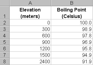
Below is a sample graph of boiling point temperature vs. elevation done with
a spreadsheet program. In order to graph the data, you first need to enter the
data into a spreadsheet. Enter one set of numbers in column A (independent
variable) and the matching set of numbers in column B (dependent variable). So,
in this instance, elevation is in column A and Boiling Point is in Column B.
(Note: you would get the actual numbers from the database on the boiling point
home page.) Here's an example of spreadsheet data.
Once you've entered the data, you need to highlight the data and have your
spreadsheet program make a graph for you. This command will vary from program to
program so make sure to review the instructions in your program. The spreadsheet
program will then create a graph for you with the elevation on one side and the
boiling point on the other...like this:
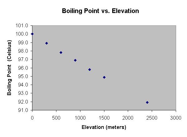
Make sure to pick appropriate scales for both the x and y axes. Boiling point will be on the y-axis for each of the graphs, and you may find it easier to view the data if the scale on the y-axis does NOT start at 0. In other words, start the values on the y-axis at about 80 degrees Celsius (or any value you consider appropriate). This way, the data will be spread out and not clumped together which can make it difficult to read.
| Project Home Page |
Copyright © 2002 Stevens Institute of Technology, Center for Improved Engineering and Science Education, All Rights Reserved