| Chart Example |
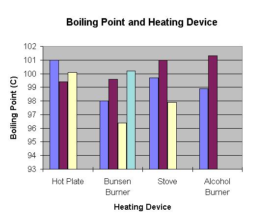
To see if there is a relationship between boiling point and the type of heating device, you will have to make a chart instead of a graph because to use a graph, all variables have to be numbers. However, there are different kinds of charts you can make that will help you decide if there is a relationship between boiling point and heating device. Below is one example; you may be able to come up with others.
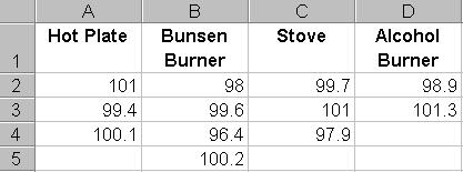
In the spreadsheet, you can create a table of all the different heating
devices that were used and then list all of the different boiling point
temperatures that were submitted for each kind of device....like this:
Then, highlight the data and choose the appropriate chart to make. Here is an
example below. With a lot of data, your chart could become very long! One option
is to make a separate chart for each heating device (on separate pieces of
paper) and then have different groups of students compare charts.
| Project Home Page |
Copyright © 2002 Stevens Institute of Technology, Center for Improved Engineering and Science Education, All Rights Reserved