| Using spreadsheets to analyse and interpret data |
|
Using Excel with Students The teacher sits down with the student (Nicole) and shows her how to enter her data into the sheet. Teacher: Nicole let's take a look at the data you printed on your state's injury rates. What is some information you found interesting about your state's injury rates? Nicole: I thought that it was interesting that most people die of motor vehicle injuries. Teacher: Let's take a look at your table. Do you see how the table has a column for "No." (number) and for "Rate"? What is the difference between number and rate?
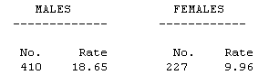
Nicole: Well the number just tells me how many people died but I am not sure what the rate means. Teacher: If you look at the top of your chart it says "NUMBER OF DEATHS CAUSED BY INJURY AND RATES PER 100,000 POPULATION BY SEX AND AGE, 1992" That means that they took the 1992 population for Minnesota and found the number of each age group per 100,000. At this point the teacher would work out the maths formula for rate with Nicole so that she could calculate the rate of each of the age groups. The teacher would also refer back to lessons Nicole had done out of the math book concerning the concept of rate. You can find the census information for population at the U.S. Census Bureau Web Site:
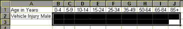
Teacher: Nicole, Now that you have a better understanding of rate when do you think that you would use rate instead of just the number of deaths? Nicole: If you wanted to compare two age groups you would want to use rate because then you would be looking at the number in comparison to how many people there are at that age. For instance if you look at the rate for 15-24 the number is 39.41, but there were 119 deaths. If you look at the rate for 85 + the number is 29.29 but there were only 6 deaths. The rate tells me more about my chances of getting into a fatal accident at each age group. Teacher: Very perceptive Nicole! Now I am going to show you a program that will help us create a graph of the data on your chart. Since you are most interested in the vehicle rates we will use that data. The program we are going to use is called Excel. Excel is a spreadsheet and it helps you organize, calculate, analyze and present data. When using a spreadsheet you can create tables, charts and graphs with just a few steps. Now start Excel. Nicole starts Excel and waits for the teacher's next instructions. Teacher: See how the window is divided in to rows and columns. The rows are numbers 1, 2, 3 and the columns are letters of the alphabet A, B, C. Remember when we learned about graphs in math. A spreadsheet is like a graph. Can you point to the cell C-3? It is kind of like finding a point on the X and Y-axis. When we fill out our spreadsheet we will want to label each of the rows and columns. What information might we want to list in row 1. Nicole: On my chart they list the age groups. Teacher: OK, let's start with the age groups. As Nicole lists the "Age in Years" in row 1 she notices that the numbers are changing to dates. Teacher: Why do you think your numbers are changing? Nicole: Well the program thinks that I want to list dates not numbers. Teacher: If you want the program to leave the numbers as you type them you will need to put a space in front of the first number. Nicole re-enters her numbers with a space in front of each entry. This is what her sheet looks like:
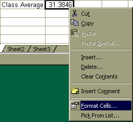
Teacher: What might be a good heading for row 2 of your sheet? Nicole: How about Male Injuries? Teacher: OK now fill in row 2. As Nicole fills in row 2 she notices that again Excel is changing her numbers. Teacher: To make the program understand that you want your numbers to have two decimal points you will have to format the cells. We will have to highlight the cells that we want to put our numbers in and format them to record a number with two decimal places. So highlight the cells.
Teacher: Choose Cells from the Format menu.
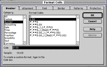
Teacher: Now click on the Number tab, choose Number from the list and make sure that you have 2 listed in the decimal places space.
Teacher: Now click OK. Now Nicole finishes entering her data for row 2 and moves ahead to row 3. This is what Nicole's sheet looks like now:
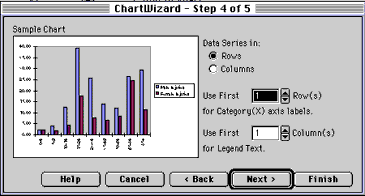
Teacher has Nicole save her sheet so far. Teacher: Now Nicole I would like you to highlight all of your data so that we can make a graph. The program will use the data you highlight to create the graph.
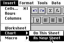
Teacher: Now look at the menu at the top of your page. From the Insert menu choose Chart but hold down the mouse button. Now choose "As New Sheet" We want to create a new sheet instead of pasting our graph into our table.
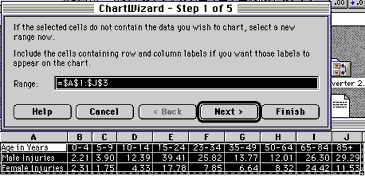
Teacher: This window tells you the range of cells you will be graphing. Your window says that we are graphing cell A1-J3. Look at the cells you highlighted is that the correct range? Nicole: Yes Teacher: Then click on the Next button. This is what Nicole sees on the screen:
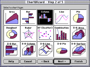
Teacher: Now lets look at how your graph would look by clicking on all of the different types of graphs. This is what Nicole's window looks like:
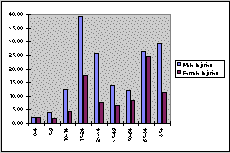
The teacher instructs Nicole to use the Next button twice to get a preview of her graph. This is what Nicole sees when she picks the bar graph:
Teacher: Now hit the Back button twice and choose another graph.
This is what Nicole's column graph looks like:
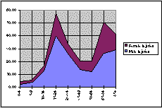
This is what Nicole's area graph looks like:
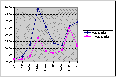
This is her line graph:
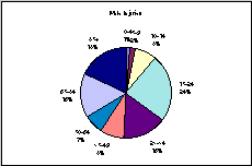
This is her pie graph:
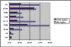
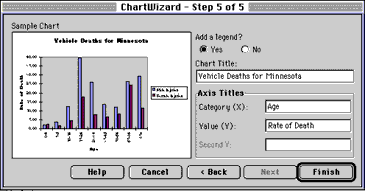
After Nicole views her options she chooses the column graph because it best displays her information. Teacher: Now that you have chosen what type of graph you would like to use you can click on the next button. This is Nicole's window now:
In this window you will need to give your graph a title, and give a title to each axis of your graph. What would you like to call your graph? Nicole: Vehicle Deaths for Minnesota Teacher: What might be a good title for the X-axis? Nicole: Age Teacher: What would be a good title for the Y-axis? Nicole: Rate of Deaths. This is what Nicole's window looks like:
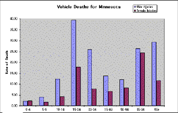
Teacher: Now click on the Finish button. This is Nicole's graph:
Now Teacher sends Nicole back to her desk, with a printed copy of her graph, to write a paragraph about what she knows about the vehicle injury rates in Minnesota. The students will share their graphs in health class and discuss the different rates for each state. Now let's explore
|