|
The best way to learn graphing
with Word is to experiment with graphing.
The meaning of graphs can be
enhanced with legends or labels
and formatting such as types of graphs,
alignment of labels, meaningful
colour of columns, background
colours and by adding a border.
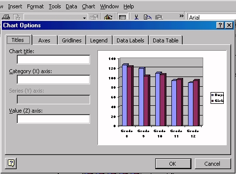
To add legends
(labels) click on Chart, then Options.
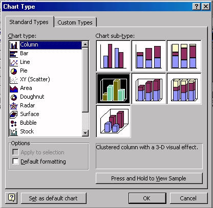
To change the
type of graph click on Chart, then Type.
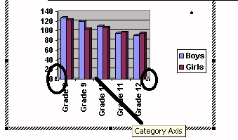
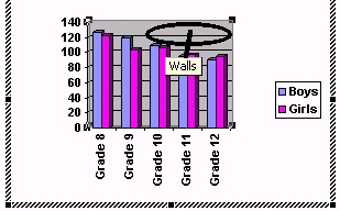
To change the
alignment of the labels, activate the graph by double
clicking it. Click on the Category axis until blocks
appear (circled below).
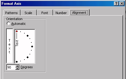
In the dialogue box select
Alignment.
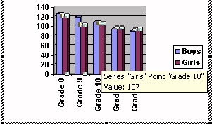
To change the colour of the
columns, activate the graph by double
clicking it. Click on the column whose colour you wish
to change.
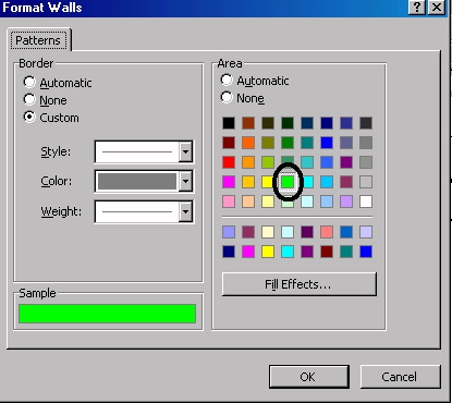
To change the
background colour, activate the graph by double clicking
it, then click in the area whose colour you wish to change.
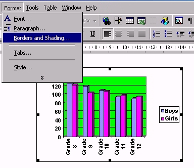
To add a
border to the graph, click on the graph ONCE, i.e. do
not activate it. Click on Format on the menu bar, then Borders
and Shading.
|