|
Chart wizard
Changing
chart options
Spreadsheets refer to graphs as charts -
one and the same thing.
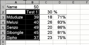
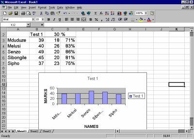
Before drawing the graph you have
to select the information you wish to graph. It would save
time if you could also select the associated labels, as shown
on the right - the labels for the column data (Column B) have
been included in the selection i.e. Column A and Row 2 have
been included.
Chart
wizard
Click on the Chart Wizard
icon 
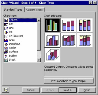
You will be taken through a process of choices
concerning your graph.
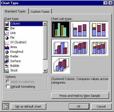
The first choice to make is to choose the
Chart type.
Then click on the Next button.
The next screen is for data range and series
choices.
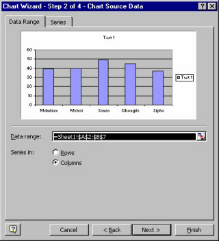
Data range describes
the area which you selected in step one, describing the cell
address of the top left cell and the bottom right cell.
That is why
it says =Sheet1$A$2:$B$7
Sheet 1 is the
file name (the file had not been saved at that stage). $A$2
is the cell reference for A2. It is what we call an absolute
cell reference (with the $ signs). An absolute cell reference
does not change when a formula is copied.
Click on Next
The next frame
gives you the opportunity to change the chart title, and offers
you the opportunity to include labels for the y-axis (side)
and x-axis (bottom). The labels (NAMES and MARKS) have
been entered in the example to the right.
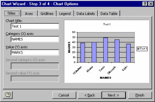
Category (X) axis labels refer to the labels
on the graph (pupil names in this case) which appear on the
x-axis (bottom) of the graph.
By clicking on the legend tab you can also
choose whether you want the legend to be visible and where
you want it to appear. Similarly, the data labels tab offers
you choice of which data labels you want, if any at all. Finally,
click on Finish.
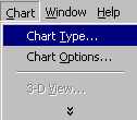
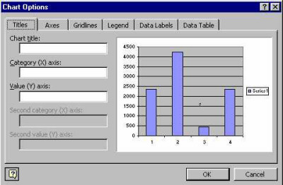
Changing chart options
To change the chart options,
Click on the Chart
Changing
the chart type:
Click on Chart
Click on Chart Type
Choose the new chart type
Click on OK
Changing the chart options (title,
labels and legends):
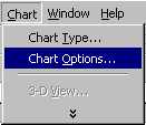
Click on Chart
Click on Chart Options
Type in the new chart title / label
/ legend details
Click on OK
|