Microsoft Excel 2007 - Drawing a line graph with more than one series
his example will plot a line graph of the relationship between pressure and volume. You can apply the same procedure to any line graph of your choice.
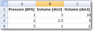
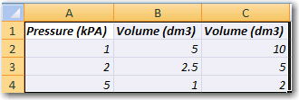
1. Enter data into an excel spreadsheet.
NB: decimals must be written with points (.), NOT commas (,).
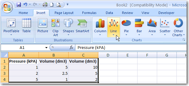
2. Select the data.
3. Click on the Insert tab and select Line chart from the Charts group.
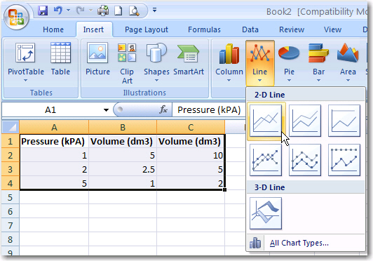
4. Select the desired Chart sub-type.
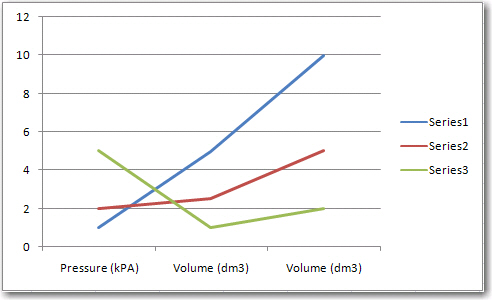
5. Your chart will look like the following:
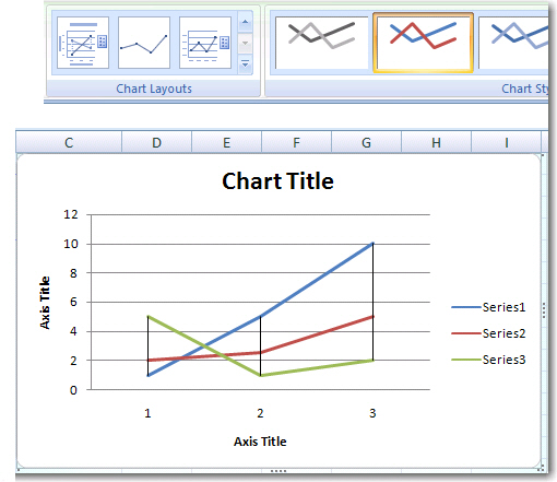
6. Select a chart layout that has axes labels. Click on the Design tab and select a layout from the Chart layout.
To ensure that you have the correct data selected and labeled for each series follow this routine (from steps 7-10) for each series:
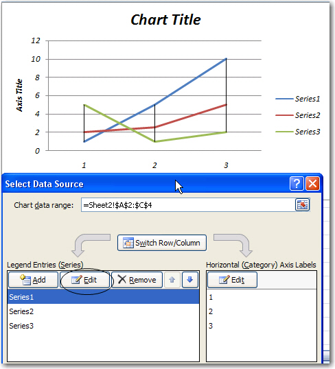
Click on the legend  . You will see select data source menu.
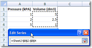
7. Click on Series1 in the Series window. Then select Edit to change the name of the series.
8. Change the series name to Volume A. Then click the cell selector (red arrow) to the right of the series value.
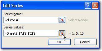
9. Change the series values to cells B2-B4 and click the cell selector to return to the graph.
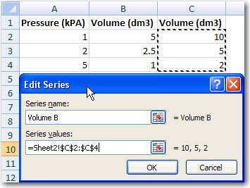
Now do the same for series 2. Change the series name to Volume B and select data from
cells C2-C4.
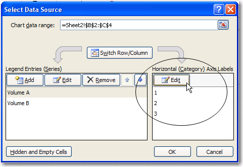
10. Now select the data field for the X-axis labels. In this case the pressure data is being used as the basis for comparison, so the fields A2-A4 are selected.
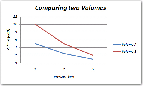
7. Enter the chart title (Comparing two Volumes) and labels for the x and y axes (Pressure kPA and Volume dm3, respectively. Just click in the label to edit.
All Rights Reserved.