Microsoft Excel 2007 - Drawing a line graph
This example will plot a line graph of the relationship between pressure and volume. You can apply the same procedure to any line graph of your choice.
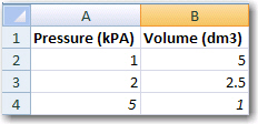
1. Enter data into an excel spreadsheet.
NB: decimals must be written with points (.), NOT commas (,).
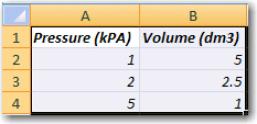
2. Select the data.
3. Click on the Insert and select Scatter chart.
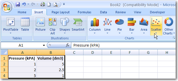
Note: Although you are drawing a line graph, it is most effective to select XY (Scatter) for this purpose.
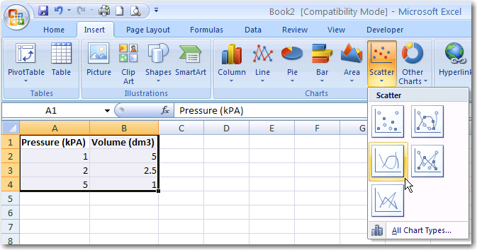
4. Select the desired Chart sub-type.
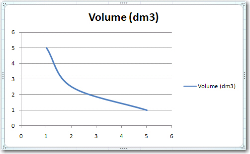
5. Your chart will look like the following:
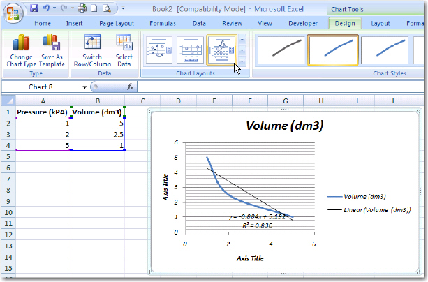
6. Select a chart layout that has axes labels.
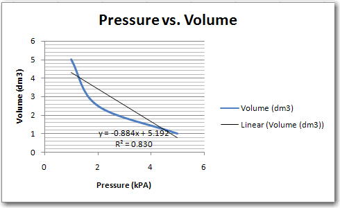
7. Enter the chart title and labels for the x and y axes. Just click in the label to edit.
Copyright
Microsoft, SchoolNet SA
All Rights Reserved.
All Rights Reserved.